


The Most Common Home Design Mistakes (and How to Avoid Them)
How overlooked details can turn a well-intentioned home design into a second-rate imitation.

After reviewing hundreds of home designs over the past few years, I’ve noticed the same errors pop up time and time again. These mistakes aren’t just minor details—many of them completely change how a home looks, feels, and functions. The good news? Most of them are easy to avoid with just a little knowledge and a bit more sketching.
Below, I’m breaking down the biggest design errors I see, explaining why they happen, and showing you clear steps to avoid them.
1. Locking in the Floor Plan Before Starting the Elevations
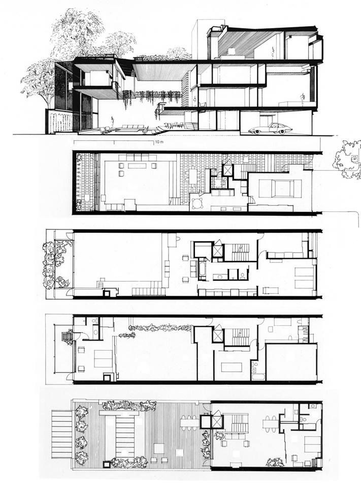
One of the biggest mistakes I see in home design is locking in the floor plan before even thinking about the elevation. The home’s exterior and interior should work together, not as two separate elements. When a floor plan is finalized too soon, it often results in an awkward elevation that feels like an afterthought.
Why it happens? Many new designers assume that since the floor plan dictates function, it should come first. But when the elevation is considered too late, the home often ends up with strange rooflines, unbalanced massing, or awkward façade proportions.
How to Dodge It
Sketch Both at the Same Time: I always start with my space arrangement template working through simple diagrams of where spaces of the home can go. As soon as a layout is ready, I quickly sketch how it would play out in elevation. Then rinse and repeat, working though many ideas quickly. If you’d like to see exactly how I do it, grab my Rayon Design Workshop
Embrace Iteration: Your first idea might be good, but you’ll never know if it’s “best” until you try at least two or three alternatives. It’s like refining a recipe: the more you tweak, the better the flavor.


2. Ignoring Elevation Proportions
It’s easy to spot an elevation that trying too hard to be “impressive.” It usually has six or more rooflines and projections all competing for the same attention, making it feel both cheap and awkward to a trained eye. Or even worse, homes that are too tall proportionally for the footprint that the have. This is often the case of the more the better, but as with anything in life, usually the opposite is where the real value is. You want a home’s massing to feel as if it’s not trying to hard, a timeless statement that get’s better with age. Think of massing as the basic shapes or “volumes” forming the house’s silhouette. If these blocks are all the same size, lack a clear hierarchy, or are stretched out of good proportions, the design feels unbalanced.
Why it happens? Far too often home designers are just unaware of the simple rule of proportions and are focused more on ceiling heights and floor plans than the elevations of the home. In reality the exterior of a home plays into the fabric of the neighborhood. If you want the neighborhood to be charming and warm, the proportions of the homes have to reflect that. Proportions are ratios, not prescriptive heights or widths.
How to Dodge It
Stick to the Golden Rule: If you want to jump into everything you need to know about proportions, check out my Tudor Style Workshop
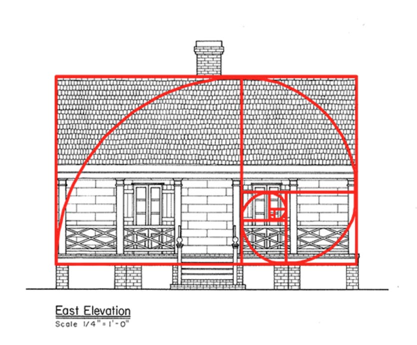
Focus on Hierarchy & Refinement: Establish a clear visual hierarchy. The home design should have a dominant massing supported by secondary volumes/voids that are smaller, and tertiary volumes/voids that are even smaller. All of this is covered in the Tudor Style Workshop and can be applied to any style (even modern ones.)

3. Treating Materials Like Wallpaper
This mistake is all too common—a house with a brick or stone front, but cheap siding everywhere else. To a trained eye, it’s an instant red flag that the design feels disconnected, low-budget, and not well thought out. Good design is cohesive from every angle, including how materials are applied. Slapping a material on one side of a wall doesn’t add value—it does the opposite, making the home look unfinished and poorly executed.
Why It Happens? People are told, “add a feature material to make it nicer,” but instead of integrating it into the home’s massing, they just stick it on the most visible façade. This creates awkward transitions where materials suddenly stop at a random edge, making the house feel flimsy rather than thoughtfully designed.
How to Dodge It
Wrap Entire Volumes: If you’re using brick, let it define a full mass—all walls around a projection—and end the material at an inside corner. If that’s over budget, focus on the porch or chimney so it still looks intentional from every angle, but with less material.
Use Logical Transitions: Materials should stop at an inside corner or a natural plane change, not mid-wall or at an outside corner.
Prioritize Quality Over Quantity: If budget is tight, fewer materials used correctly will always look better than a mix scattered across the façade. A well-placed, fully wrapped feature looks higher-end than multiple unfinished accents.
4. Settling Too Soon with the Floor Plan
It’s easy to get attached to a floor plan too early, locking in a layout before fully testing alternatives. But rushing this step can leave a design feeling disjointed or missing key opportunities that could elevate both function and experience.
Imagine a layout where a pantry is tucked into a prime sunlit corner—flipping it elsewhere could allow that natural light to flood into the kitchen rom now multiple sides, creating the bright and airy feel that so many homeowners crave.
These aren’t just small tweaks; they’re the kinds of decisions that take a home from basic to exceptional. Taking the time to test different layouts ensures that every space works together in a way that feels both intentional and effortless.
Why It Happens? Many designers (and clients) get fixated on an early concept that checks the basic boxes without questioning whether a different layout might work better. The pressure to move forward can override the instinct to step back and refine. But skipping this exploration phase often results in missed opportunities—poor sightlines, awkward transitions, or wasted space that could have been optimized.
How to Dodge It
Test Multiple Concepts: Before committing, experiment with broad layout shifts. What happens if the kitchen moves to the opposite side for better light? Would flipping the garage entrance improve access to a scullery or mudroom? These early adjustments can make a big difference. If you’d like to see exactly how I do it, grab my Rayon Design Workshop
Refine the Details: Once a strong concept is chosen, fine-tune it. Adjust walls, shift openings—maybe moving a door allows space for a built-in or better furniture placement. Even small changes can elevate both function and flow.
Prioritize Both Form and Function: The best layouts balance efficiency with aesthetics. A well-placed powder room, a strategically positioned entry, or a slight shift in circulation can take a design from good to great. The key is not settling too soon.
If you’re serious about improving your home design skills and want my guidance every step of the way, the Home Designer Masterclass is for you. It’s an eight-week (live session & recorded lessons) deep dive where you’ll learn everything I know about home design and apply that knowledge though a personal project. You’ll walk away with the confidence to create beautiful, functional home designs
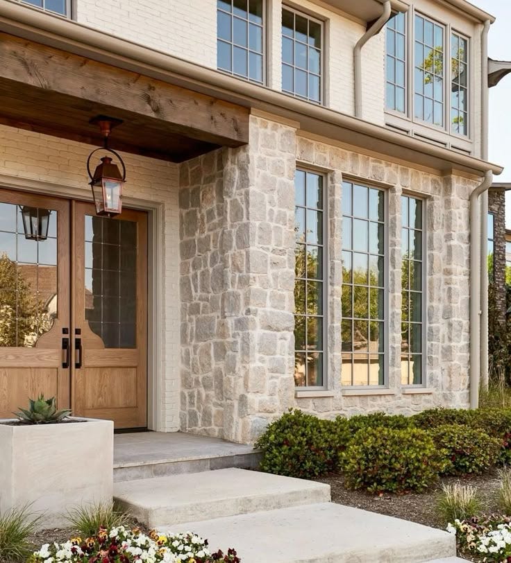
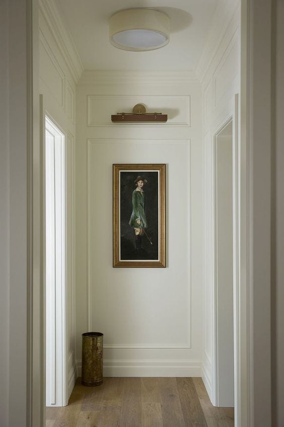
5. Neglecting the Entry
The entry is one of the most impactful elements of curb appeal—it sets the tone for the entire home. A well-designed entry isn’t just about looks; it creates a sense of arrival and welcome for both homeowners and guests. When this space feels cluttered with multiple doors leading to different rooms, it loses its presence and can feel more like a hallway than a proper entrance. A front entry that feels effortless and proportionate elevates the entire home, creating a seamless transition between exterior and interior spaces.
Why It Happens? Entries are often treated as an afterthought, squeezed between other spaces without consideration for scale or flow. A front door that’s awkwardly placed, too small for the façade, or lacks architectural framing can make the home feel incomplete. Inside, failing to define the entry properly can lead to a cramped, transitional space or a chaotic hall full of doors rather than a welcoming focal point.
How to Dodge It
Frame the Entry: Use recessed doorways, columns, or a covered porch to create a strong sense of arrival. The path leading up to the door should feel natural and intuitive. There are both traditional and modern ways to addressing this.
Prioritize Lighting: Warm, well-placed lighting enhances architectural details and improves nighttime curb appeal. Inside, consider where wall sconces might go or a table lamp.
Define the Interior Drop Zone: The space just inside the door should feel intentional—whether space for a small table, a built-in bench, or simply a clear area for people to pause, take off shoes, or set down bags. Avoid cluttering the entry with too many doors leading directly into different rooms.
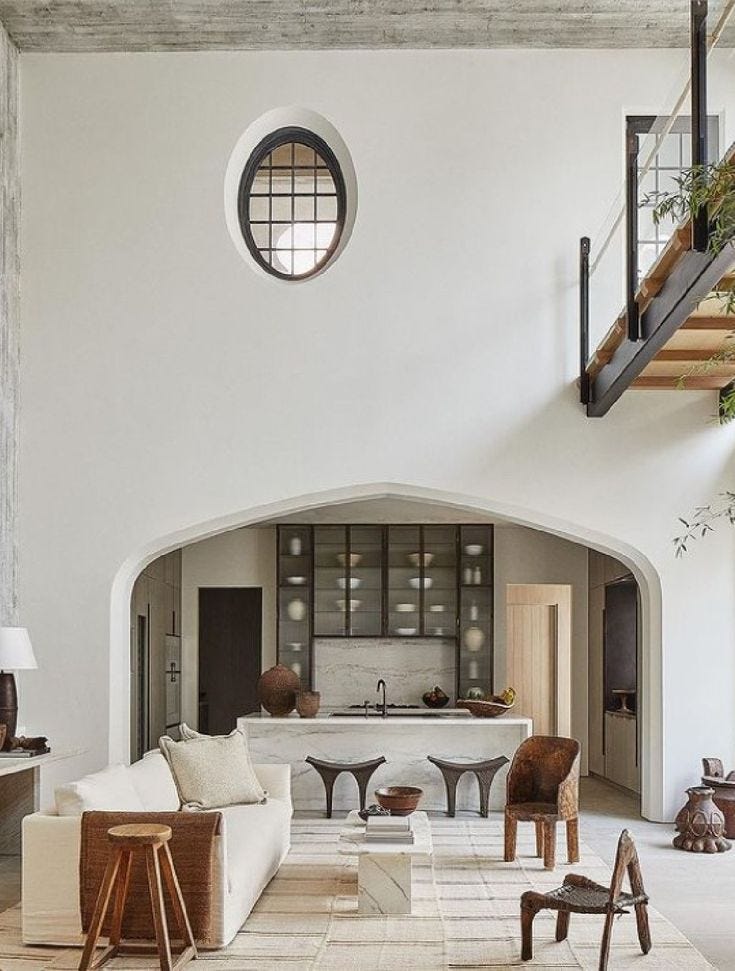
6. Not Defining Spaces Intentionally
Open-concept design is popular, but without intentional separation, spaces can feel chaotic rather than open and inviting. A maze never-ending walls, oversized openings, and undefined areas leaves rooms bleeding into each other with no clear sense of purpose. Without structure, furniture placement becomes a challenge, creating an awkward home to live in and look at.
Why It Happens? Many designers avoid walls, fearing they’ll make a space feel smaller or restrict flow. But not having enough can create a “corn maze” effect, where spaces feel disorganized and endless with no clear boundary. This can also make a home’s ceilings feel lower than they actually are because of the long proportion the space has without walls. In modern design, separation should be through planes, volumes, and subtle shifts to create distinction without closing rooms off. Traditional and modern design are addressed as opposites when it comes to defining spaces.
How to Dodge It
Use Architectural Framing: For traditional (most homes - even those calling themselves transitional) enclose spaces in walls, then punch openings through to the next. Consider how these are placed and detailed.

Look to Architectural Precedents: For modern inspiration look to projects like Mies van der Rohe’s Barcelona Pavilion or Paul Rudolph’s Milam Residence see how walls, screens, and volumes define the spaces instead of weaving walls.

7. Ignoring Privacy Between Shared and Private Spaces
One of the most overlooked aspects of home design is how private spaces—like bedrooms and bathrooms—are accessed. Too often, I see homes where doors to private rooms open directly off a main living space, kitchen, or entry, with no transition, making them feel exposed and disconnected from the rest of the home. A well-designed home doesn’t just function—it considers how people experience each space. This small adjustment can completely change how comfortable a home feels in daily life.
Why does this happen? Many designers prioritize squeezing in extra square footage over considering the experience of moving through a home. The result? A bunch of doors lining a living room or kitchen, creating zero separation between public and private areas.
How to Dodge It
Use short hallways or alcoves to provide a transition between common spaces and bedrooms. I’ve worked on 900-square-foot cabins that managed to create this separation—it’s all about thoughtful planning. Creating a small buffer zone between shared and private spaces enhances privacy and makes a home feel more intentional.
Group private spaces together when possible, keeping them away from high-traffic zones like kitchens and living rooms.

8. Not Considering Flow and Function with Furniture
Every home will have furniture—yet so many complete house plans fail to consider it. Room sizes should be determined not just by square footage but by how they will actually be used. Without this consideration, even a spacious home can feel cramped and awkward.
Why does this happen? In many cases furniture is simply left out of the design process with the thought that the owner or a separate decorator will figure it all out. In other circumstances, furniture is shown, but is the incorrect size and misleading on how the room will function. Both can be disastrous. Even if furniture layouts are not 100% defined, something should be shown in plan and thought through of the correct scale for that project.
How to Dodge It
Design with furniture placement in mind. Using proper sizes for the project - ask the client if they want an extra deep sofa or an apartment sized sofa - then play with simple layouts for the space
Allow proper clearance. Ensure at least 36-60+ inches of clearance in high-traffic areas. If you're unsure about proper clearances for different spaces, my Comfortable Clearances eBook provides detailed guidance on ideal dimensions to create a home that feels spacious and functional.
Consider sightlines and focal points. Think about how the furniture interacts with fireplaces, windows, doorways, and built-ins to create a balanced feel.
Final Thoughts Before You Get Back To Designing
Most home design mistakes aren’t about spending more money—they’re about planning carefully and making thoughtful, intentional design decisions. Small refinements can have a huge impact on how a space feels and functions. Always keep in mind proportions, material placement, flow, and how each room connects to the next.
If you're looking for hands-on guidance to improve your home design skills, join me in my Home Designer Masterclass. An 8-week live intensive home design course - taking you step by step through Rafi's process of designing with recorded home design lessons and virtual studio sessions twice a week. By the end you'll have designed a portfolio worthy home design and built lasting connections with fellow designers.
This list just scratches the surface of common mistakes that I see. If you have any, I’d love for you to comment them below!
- Rafi